CHALLENGE
Preply, an online learning platform connecting students with tutors worldwide, sought a visual identity that would reflect its mission of making education accessible, engaging, and transformative. As the brand grew, it needed a design that showcased its personalized approach to learning while highlighting its innovative spirit.
SOLUTION
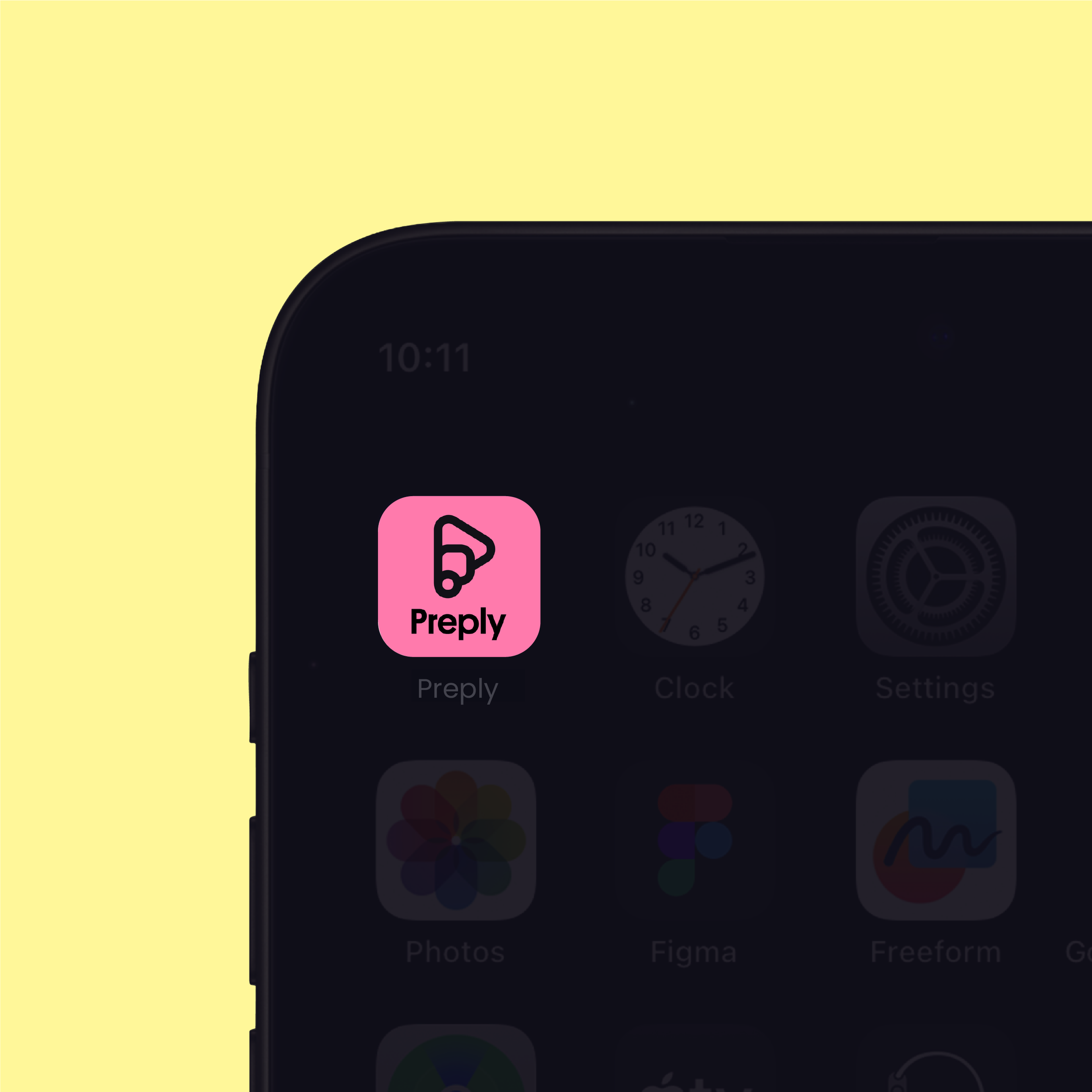
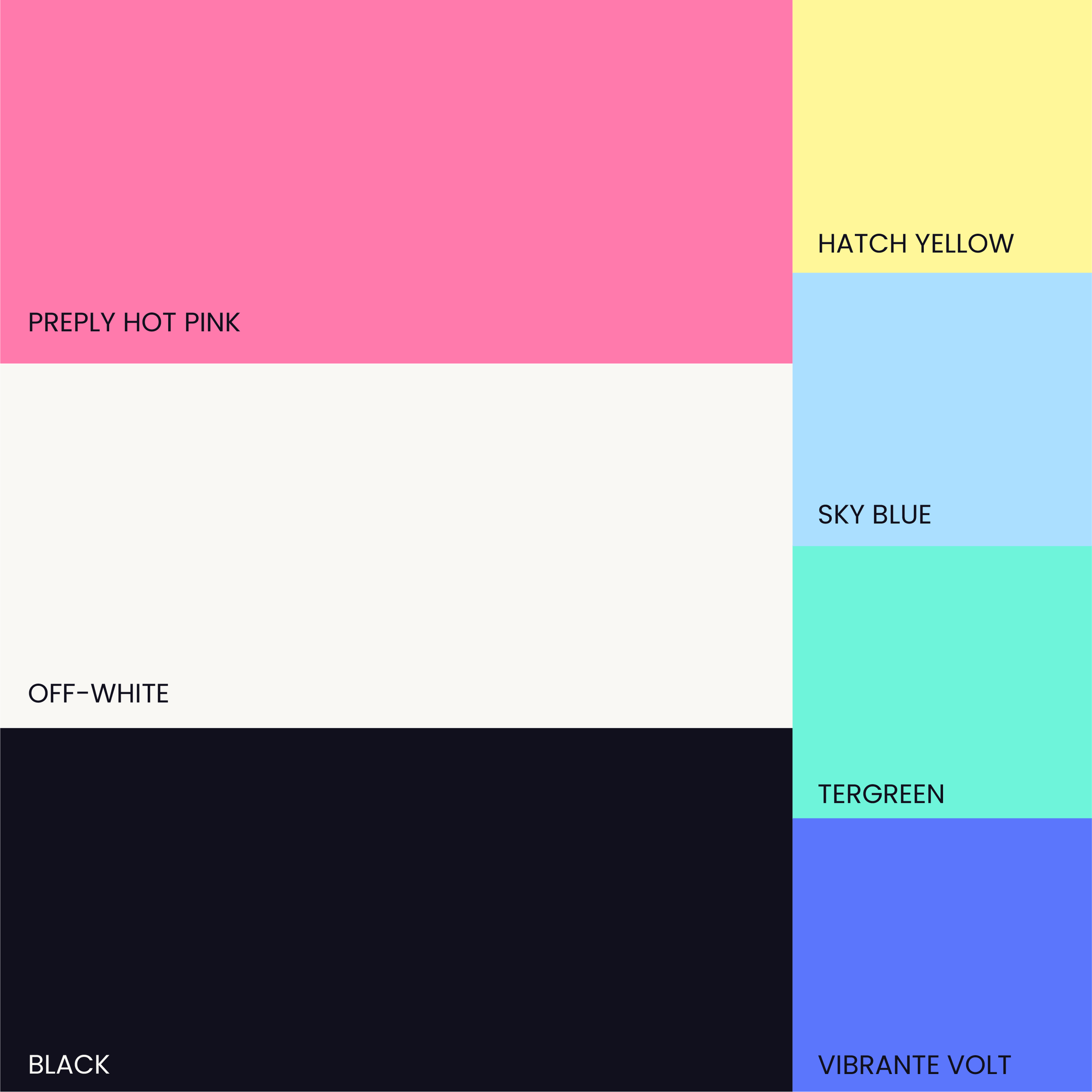
We developed a comprehensive brand system that blended professionalism with approachability, capturing Preply’s dynamic, global presence. The new logo, set in a modern sans-serif typeface, conveys clarity and trust. We chose a vibrant color palette, inspired by a balance of energy and calm, to embody Preply’s promise of unlocking potential through education.
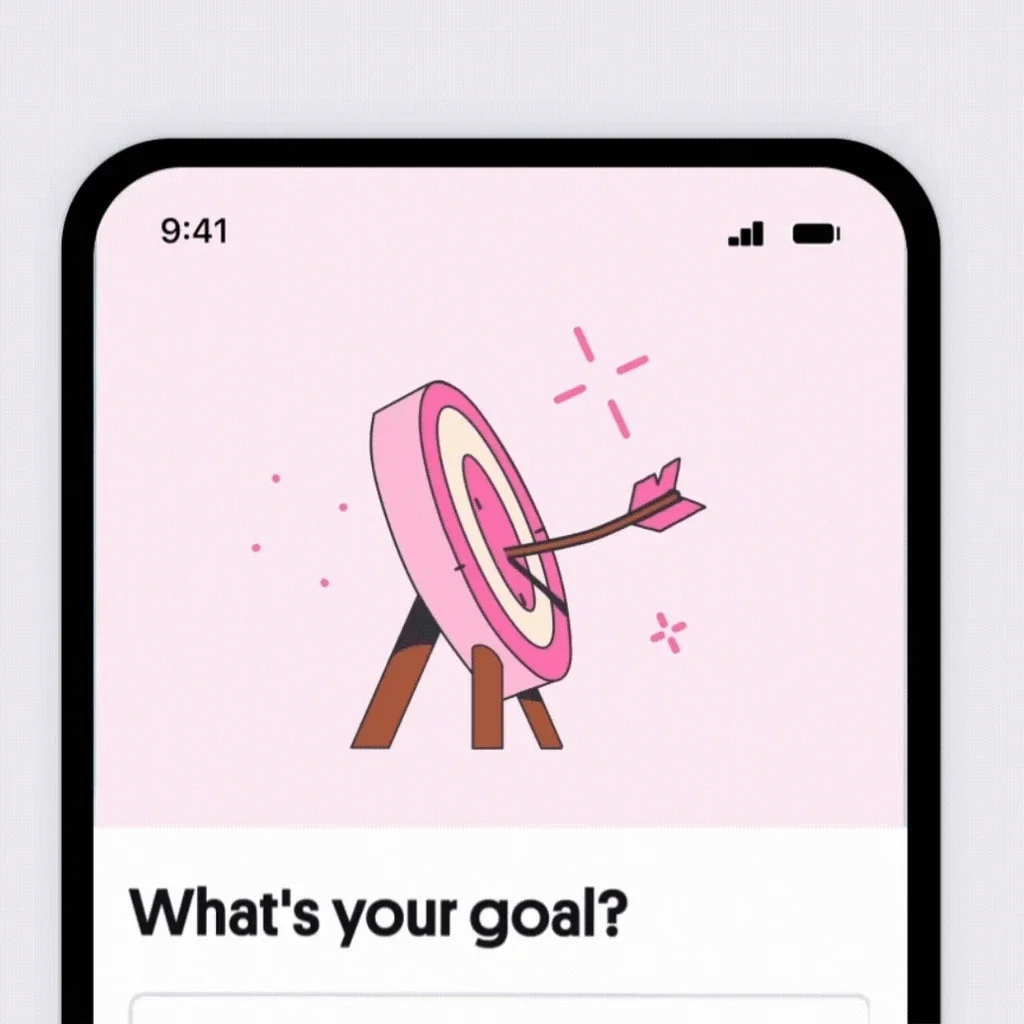
In addition to visual design, I led the motion design elements, incorporating subtle animations and transitions that enhance the brand's interactive experience. Playful icons and patterns convey the idea of progress and possibility, while motion graphics brought these concepts to life, enriching the platform’s user experience.
The result is a cohesive brand identity that resonates with both students and tutors, reflecting Preply’s forward-thinking approach to online education.